5 Unique Web Design Trends For 2021

When it came to designing, we kept an eye on the never-ending trends on the web but 2021’s web design trends appear to share a common theme: rather than aspiring to hi-tech fantasy, web designers are seeking new heights of realism.
We put together a comprehensive list of some of the web design trends we expect to see well into 2021.
Full-page headers
Full-page headers are the way to go for modern web design in 2021. Web designers can implement header variations, but a popular setup involves adding key text or call-to-action (CTA) buttons to the left of the header with eye-catching images on the right. This is because readers tend to focus most of their attention on the top-left of your page.
Example: Discord exhibits fun and quirky image to the right of their header and highlights the benefits of their paid service to the left. Their CTA buttons are clearly marked and tell viewers exactly what they need to do to get the added experiences.

Parallax scroll animations
Parallax scroll effects have been a trend in website design for years, and in 2021 we hope to see more creative explorations of what can be accomplished with parallax.
Parallax is the optical illusion that happens when objects near to the viewer appear to move faster than objects farther away. Although we see this in everyday life—when viewing passing scenery while driving, for instance—the effect on web pages comes across as equal parts real and surreal.
Here are some guidelines designers taking into account:
Don’t let parallax effects distract from the important information
Don’t make it harder for the user to complete an important task
Keep the number of parallax effects to a minimum
Include an option for users to turn off parallax effects
Light Colors
Using light colors in web and interface design represents one of the biggest differences between print and web design. Designers have now embraced the advantage of using light colors in order to avoid the latter.
The added value of using light colors in web design extends beyond the visitor’s visual experience.
Light colors are also conducive to user engagement. The soothing effect of light colors often encourages users to stay on the page for longer, enjoying the color palette’s tranquility and warmth.

3D visuals
With the advent of higher resolution screens, 3D design has come a long way from the blocky and beveled edges of Geocities. We’ve been seeing high-quality 3D visuals weaved seamlessly into web designs. Instead of being garish distractions, they’re adding to the overall user experience.
The creative agency Sennep throws in dashes of depth with 3D elements throughout their website. There’s a nice sense of harmony here between all of the design elements. This is a perfect example of how in more minimalist layouts, 3D can make an ever bigger impression.
Cartoon illustrations
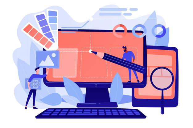
There was a time not that long ago when websites were just text and a few images or graphics. Web design has evolved, with designers now creating work that connects with people on a more personal level. Cartoon illustrations have gained popularity as a way of transforming websites with a healthy dash of humanity.
There are so many sources out there and artists crafting fantastic cartoon illustrations.
Cartoon illustrations offer so much in terms of creativity and making a brand more personable. We’re looking forward to seeing a growing cast of characters throughout web designs in the coming year
